Building a Filterable Portfolio With Elementor Pro

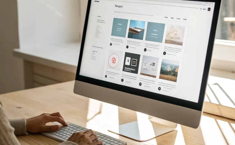
Clients and recruiters want to see only the work that matters to them. A filterable portfolio allows visitors to sort projects by category, technology, or role. Below is a detailed walkthrough for building this feature in Elementor Pro, using the ReeniClone design as an example.

Prerequisites

  • WordPress 6.2+ with Elementor & Elementor Pro installed.
  • A custom post type called Projects (created via the CPT UI plugin or code).
  • Custom taxonomies: Project Type and Technology.

Step 1 – Create the Project Template

In Elementor > Templates > Add New, choose “Single” and select the Projects post type. Use the following widgets:

  1. Featured Image: Full‑width, with a subtle box‑shadow.
  2. Project Title: Heading widget, Rajdhani, 60 px, color #FF014F.
  3. Project Details: Icon List widget for client, date, and tools used.
  4. Content: Text Editor for description, using Rubik body font.

Style the section background with #141414 and round the corners to match the site’s card design.

Step 2 – Build the Archive Page

Go to Elementor > Templates > Add New > Archive. Select the Projects archive. Add these sections:

  • Section 1 – Filter Bar: Use the “Posts” widget, enable “Query ID” (e.g., portfolio_filter), and turn on “Custom Filters”. Add Buttons for each taxonomy term. Set the button style to the pink pill shape.
  • Section 2 – Grid: Still within the Posts widget, choose “Skin: Cards”, set columns to 3 (desktop), 2 (tablet), 1 (mobile). Use the card layout that matches the #141414 background and round corners.

Enable “AJAX” so the grid updates without page reload, preserving smoothness.

Step 3 – Add Custom CSS for Hover Effects


/* Card hover */
.elementor-post:hover {
    transform: translateY(-5px);
    box-shadow: 0 12px 20px rgba(255,1,79,0.3);
    transition: all 0.3s ease;
}
/* Filter button active state */
.filter-button.elementor-active {
    background: linear-gradient(135deg, #ff014f, #ff6fa1);
    color: #fff;
}

This CSS reinforces the brand’s pink accent on interaction.

Step 4 – Make It Responsive

Elementor automatically adjusts columns, but double‑check the breakpoints:

  • Desktop (≥1200 px): 3 columns.
  • Tablet (768‑1199 px): 2 columns.
  • Mobile (≤767 px): 1 column, filters stack vertically.

Step 5 – SEO & Performance Tips

  1. Use descriptive alt attributes on project images.
  2. Limit the number of visible cards per page (e.g., 9) and enable pagination.
  3. Leverage caching plugins (WP Rocket, LiteSpeed) to keep AJAX requests fast.

Conclusion

With Elementor Pro you can build a sleek, filterable portfolio in less than an hour. The result is a fast, visually consistent gallery that mirrors the dark‑theme aesthetic of ReeniClone while giving visitors instant access to the most relevant work.

Showcasing Skills with Interactive Progress Bars in Elementor

Progress bars are a popular way to visualize expertise levels in portfolios. In ReeniClone they blend seamlessly with the dark theme, using pink #FF014F as the fill color and subtle shadows for depth. This tutorial walks through building responsive, animated skill bars without custom code.

Step 1 – Prepare the Data

Decide which skills to display and assign a percentage. Example:

  • UI/UX Design – 95%
  • Front‑End Development – 90%
  • WordPress & Elementor – 92%
  • Graphic Design – 85%

Step 2 – Add the Elementor Progress Bar Widget

  1. Drag a Progress Bar widget into a column.
  2. Set the Title to the skill name.
  3. Enter the Percentage (e.g., 95).
  4. Under Style → Bar, change the Background Color to #141414 (matching card background).
  5. Set the Active Color to #FF014F (brand pink).
  6. Enable Animation and set Duration to 1.5 s for a smooth fill.

Step 3 – Create a Consistent Layout

To keep spacing uniform, use the following column settings:

  • Width: 100% (full‑width on mobile).
  • Padding: 20 px top/bottom, 0 left/right.
  • Background: Transparent (the surrounding card will provide the dark backdrop).

Step 4 – Add a Card Wrapper

Wrap each progress bar in an Inner Section widget and apply these styles:


selector {
    background-color: #141414;
    border-radius: 8px;
    padding: 15px;
    box-shadow: 0 4px 12px rgba(0,0,0,0.6);
}

This creates the card look seen across the ReeniClone site.

Step 5 – Make It Responsive

On tablets, display two columns side‑by‑side; on mobile, stack them. Use Elementor’s responsive column width settings (50% on tablet, 100% on mobile).

Step 6 – Optional: Add Hover Interaction

For an extra touch, add a tiny scale‑up on hover:


selector:hover {
    transform: scale(1.02);
    transition: transform 0.3s ease;
}

This subtle effect aligns with the site’s other interactive components.

Final Result

You now have a set of animated, brand‑consistent skill bars that convey expertise at a glance. Because everything is built with Elementor’s native widgets, the solution stays lightweight and easy to update.

Conclusion

Interactive progress bars enhance credibility and break up text‑heavy sections. By following the steps above, you can replicate the sleek look of ReeniClone’s skill showcase on any portfolio site.

Conteúdo protegido pela Lei 9.610/98, que regula os direitos autorais tanto artísticos quanto acadêmicos. A violação dos direitos aurorais é CRIME previsto no artigo 184 do Código Penal. Você não pode copiar nem reproduzir partes sem autorização expressa do autor.  No entanto, você pode compartilhar o link livremente e fazer menções, desde que citando a fonte.